DESIGNER/HAND LETTERER/ART RETOUCHING
Author: Jonathan Garnier
Illustrator: Yohan Sacré
Editor: Anne Hoppe
Publisher: Houghton Mifflin Harcourt: Books For Young Readers
Publishing Date: 10/13/2020
Jacket Specs: Matte Lamination, Spot Gloss
Not every book that I work on is something that I have a hand in from start to finish– this is true of many of my projects! Often books that have done well internationally are purchased from abroad and brought back to the United States for publication. That process involves many steps including translation, localization for an American audience, and in my case: redesigning the cover for the American book market! This was the case for Timo the Adventurer, by Jonathan Garnier and Yohan Sacré.
Timo L’aventurier, originally published in two French-language volumes by a Belgian team, was brought to Clarion Books by the phenomenal editor, Anne Hoppe. It was my job from the beginning to advise on how best we could adapt a book that looked and felt uniquely European to fit on American shelves. For folks who aren’t in the thick of the publishing world, it might sound odd when we say “this looks French” or “that had to be pubbed in the UK”. However, when you spend every day looking at books and becoming familiar with the various subject matters, styles, and format choices, you learn the tells for a book published abroad, and how to adjust it to conform to what sells well in your home market.
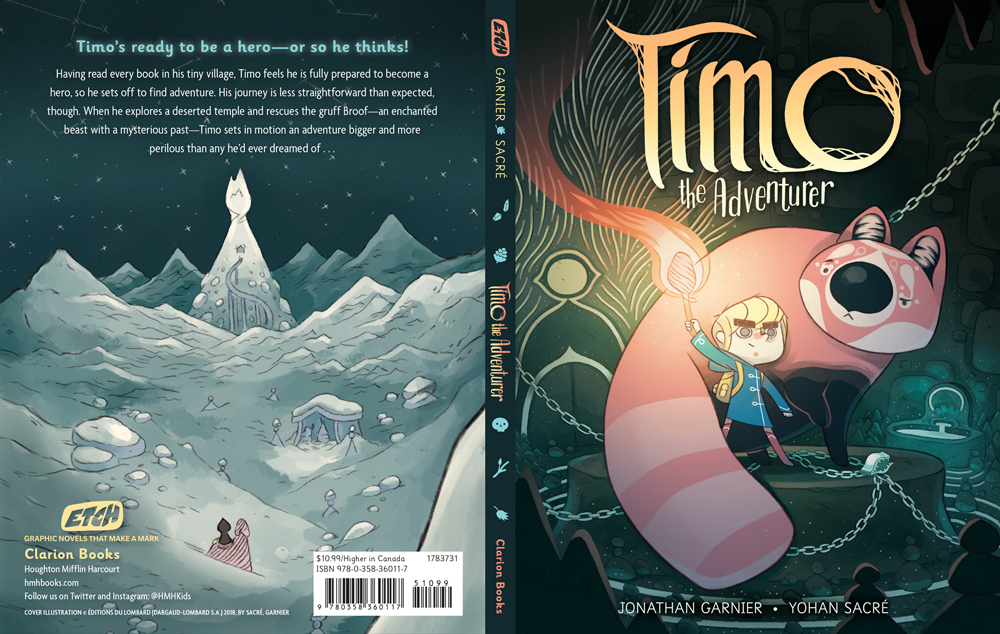
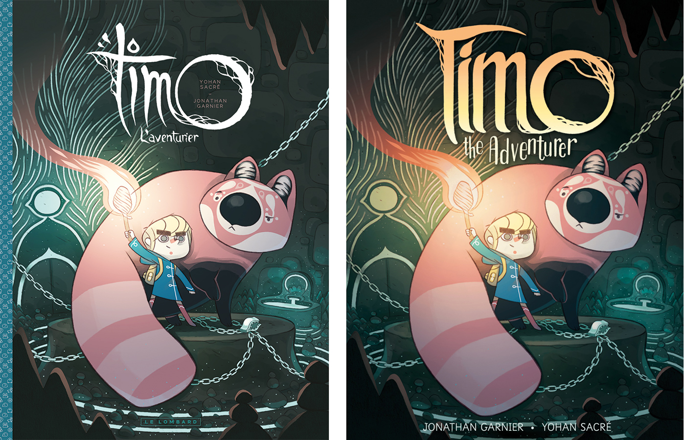
In the case of Timo, the original run was published in two slim volumes of a large format size (8.7″x11.6″!). Though that trim size is not at all uncommon in French comics, that would be closer in size to what we’d expect from a picture book in the US rather than a graphic novel. The title type for the original was delicate and organic looking– absolutely beautiful!– but thin and white against an illustration with a somewhat subdued palette, and featuring a patterned strip down the left side, mimicking a “three-piece-case” look. (See below for original cover comparison!)
We looked to other books in the genre that were doing well and knew we’d need to scale the book down to a new, smaller trim, which meant I would be redesigning the full interior, carefully replacing the translated text into the bubbles which were now much smaller due to the change in size. (As an aside, I must commend the translator, Lara Vergnaud, for her sublime work. The dialogue is hilarious, witty, and fresh– one would never suspect that it was not originally written in English!) Prior to redesigning the full interior layout, I worked with our Production team to do test prints of a few selected spreads of art on both coated and uncoated paper stock, in regular CMYK printing and a variation using something called a “special mix” which uses Rhodamine magenta pigment and produces much brighter, cleaner colors– especially important for the interior scenes that featured hot-pink and bright orange fires in an underground forge. We settled on coated stock and the special mix ink which made the otherwise quiet tones of the palette really POP from the page!
For the cover, we set about addressing the title type in a way that took inspiration from all the things the Belgian design did so beautifully while making it bolder and more colorful. I re-lettered the title several times, trying it with more curves, in all lower case, in lime green, peach, and blue. Ultimately, we landed on a capital T with bold, upright lines, and a gradient that makes the word feel illuminated by the fire from Timo’s torch. These choices were made to improve legibility, especially when viewed at a thumbnail size on online retailers, and to hopefully grab the eye of our target audience: kids who dream of adventure, just like young Timo does! You may also notice that our cover has more saturation, and more of a dramatic golden glow coming from the torch in Timo’s hand— this was intentional to draw the eye in to him, and to give the type a mysterious and dark background to sit against. If you scroll below, you’ll also see how I extended a panel from the interior to become our back cover in the hopes that we could show off the beautiful scope of the story and world building a little more.
Altogether, this is a lovely book and I’m proud it was added to the inaugural season of the Etch imprint!
HAND LETTERING AND FRONT COVER RETOUCHING
art extenSion
")
")